 YOSHINO-YU
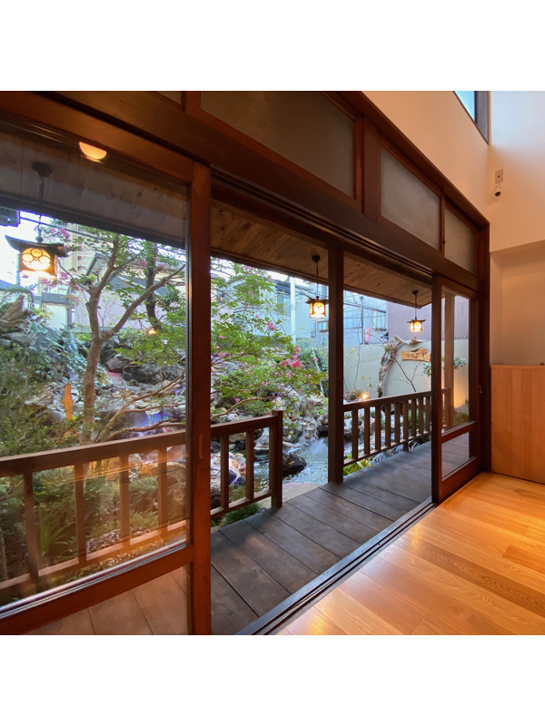
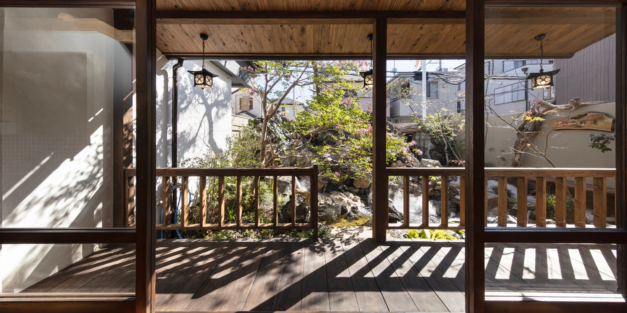
The tsuboniwa (small courtyard garden) and engawa (veranda) were characteristic features of traditional wooden Sento. Although these are modest spaces, they are elements that evoke a sense of nostalgia, something I truly cherish in Sento design. In the Kanto-style Sento, which became formalized after World War II, the “engawa and tsuboniwa,” like the palatial architecture, high windows, and mural paintings, were one of the distinctive core elements of Sento design.
However, throughout the Showa era, many of these engawa and tsuboniwa disappeared from wooden Sento. They were replaced by “coin-operated laundries,” which were installed in the spaces where the engawa and tsuboniwa once stood. The laundry income became a secondary source of revenue to support Sento businesses, which had been struggling with declining customer numbers. It was indeed a reflection of the “changing times.”
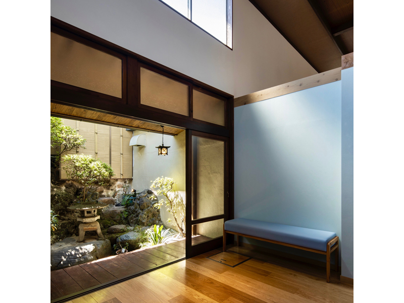
As a result, Sento with “engawa and tsuboniwa” have become rare in the modern day. However, Yoshino-yu has preserved this feature. Particularly on the women’s side, the tsuboniwa was relatively large for a Sento and even had a pond. In the renovation plan, this (former) women’s side tsuboniwa, which could now be considered Yoshino-yu’s identity, was restructured to face the lobby area. It was designed as a space where families and couples could enjoy the “engawa and tsuboniwa” together after their bath, becoming a key feature of the establishment. The tsuboniwa on the men’s side, while maintaining its traditional form, was refreshed, and another new tsuboniwa was added on the women’s side (garden design by Uemori Co., Ltd.). As a result, Yoshino-yu now boasts three “engawa and tsuboniwa” spaces. Whether it’s enjoying the cool air after a bath, relaxing with family, or taking a break with a beer and snacks, guests can savor these moments while gazing at the garden. There’s nothing quite like the refreshing feeling of enjoying the outdoor air after a bath. The tsuboniwa and engawa significantly enrich the Sento experience.
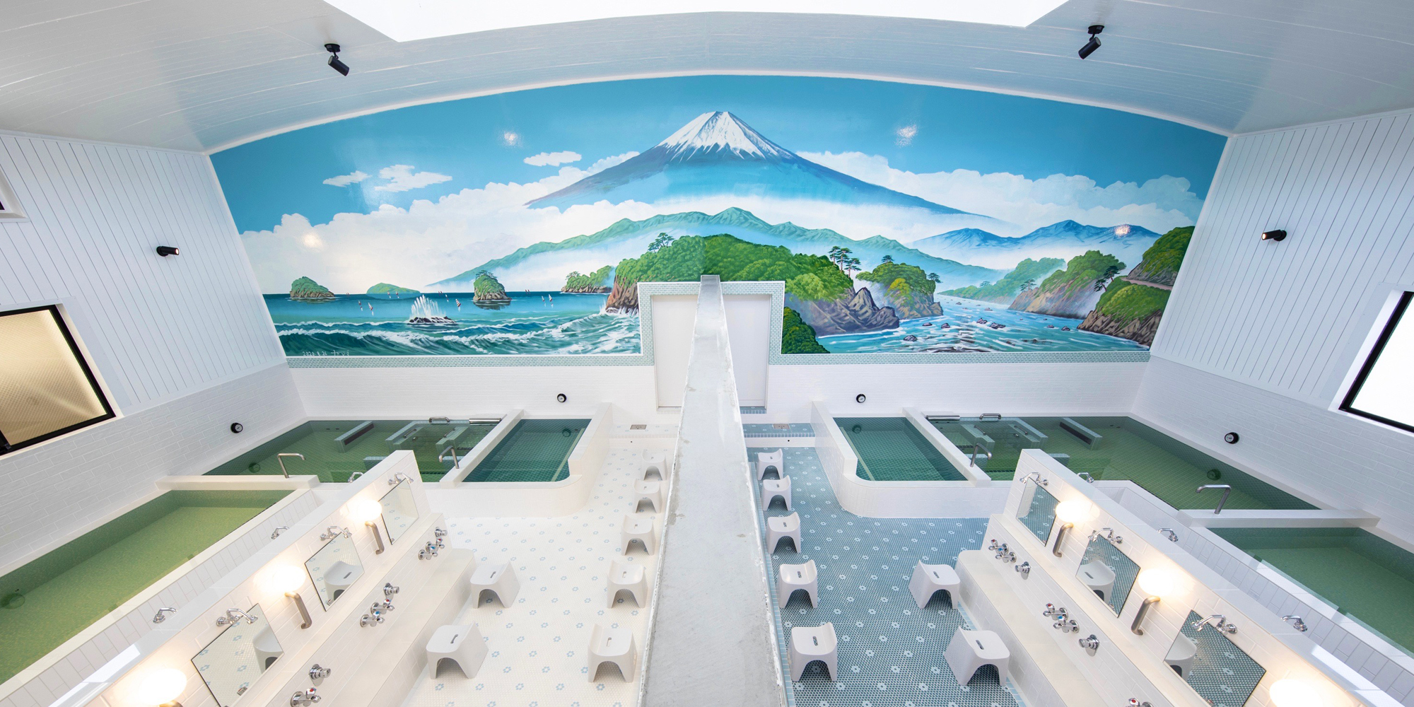
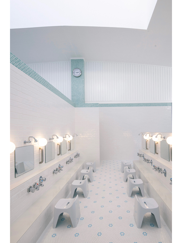
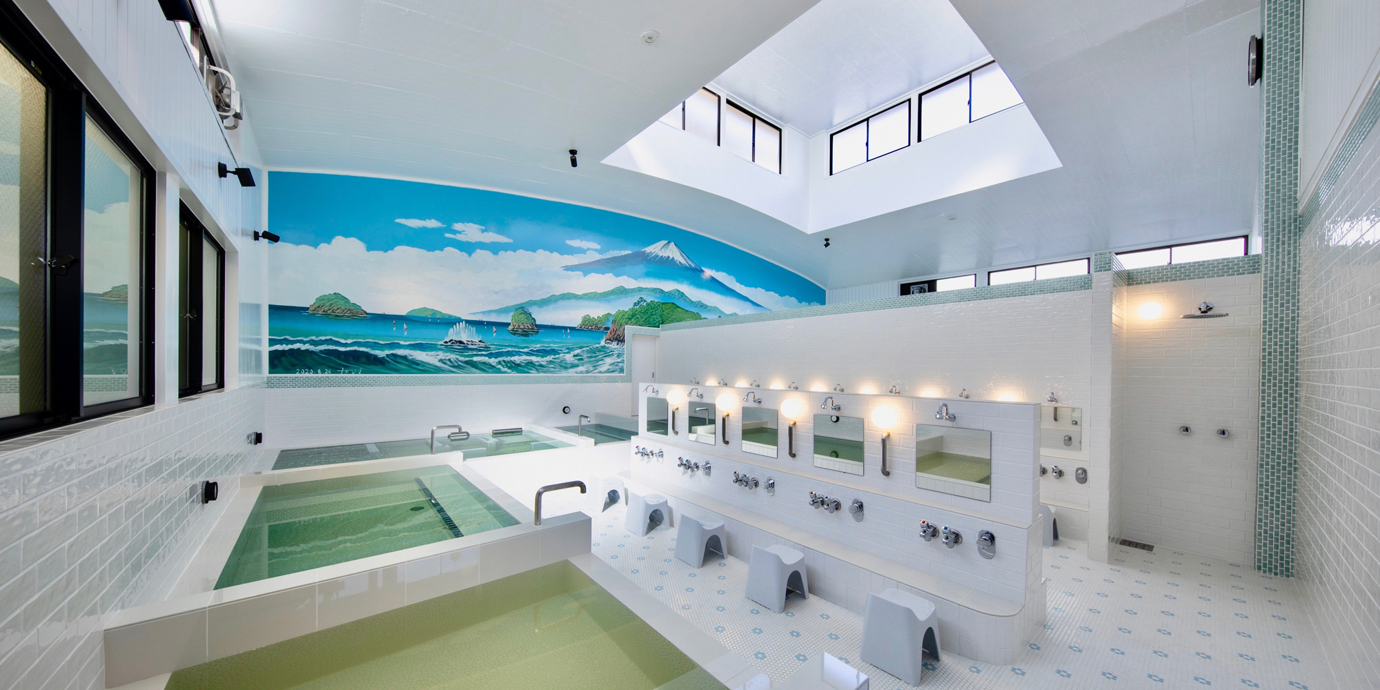
When people imagine the typical bathing area of a Sento, many think of the color scheme of “blue and white.” In the renovation of Yoshino-yu’s bath area, which is based on the classic Sento design, we deliberately chose this traditional “blue and white” color scheme to evoke the quintessential Sento atmosphere. The ceiling, originally made of wooden planks, was repainted with layers of paint. While this decision was made to keep renovation costs down, the rough texture created by the multiple layers of paint represents the passage of time in the space, something I, as the designer, greatly appreciate. The clean, streamlined “bath rib” panels commonly used in modern bathhouses just don’t seem to suit the nostalgic charm of a classic Sento.
